First tests
First tests and exploring the algorithms
So what do we want to achieve? There is a set of source images which correctly ordered, should display a larger image. Like this:
 Author: J2thawiki. Source: wikipedia.
Not necessarily with this wired aspect ratio of the source images, but you get the point.
Doing this manually for a couple hundred pictures might be possible. But what about a couple thousand or even a couple million?
Finding the colors
So each picture is contributing (a) color to the overall meta-picture. And when you step further away it will blend in to form the hole picture. The color contributed is kinda the overall color-tone of the image, which should be influenced by the pictures dominant color, where the dominant color is the color (including its shades) occurring the most in the picture.
If we take a look at these 3 images:
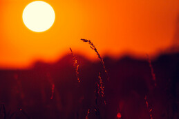
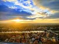
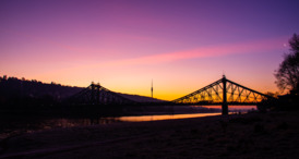
We would expect, some kind of orange for the first one, yellow or blue for the second one and purple for the third one.
This already shows a potential problem, if the ratios a close, we could get wired effects.
K-Means clustering
But let’s continue. How to extract the colors from the image? Just counting each individual color would be way inaccurate because the differences wouldn’t be significant enough. So we need to break it down to shades of colors and make the images “look” like this:
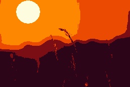
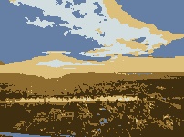
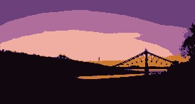
Now it is far more obvious what the colors are. We have a dark red in the first image, and orange/brown in the second and something close to black in the third one.
But to get there? What I have done to the pictures is called color quantization. Which means, I reduced the number of distinct colors in the image. This can be done with an algorithm called K-Means-Clustering. This is an algorithm commonly used in machine learning and data mining.
From Wikipedia:
k-means clustering is a method of vector quantization, originally from signal processing, that aims to partition n observations into k clusters in which each observation belongs to the cluster with the nearest mean (cluster centers or cluster centroid), serving as a prototype of the cluster. This results in a partitioning of the data space into Voronoi cells. It is popular for cluster analysis in data mining. k-means clustering minimizes within-cluster variances (squared Euclidean distances), but not regular Euclidean distances, which would be the more difficult Weber problem: the mean optimizes squared errors, whereas only the geometric median minimizes Euclidean distances. For instance, better Euclidean solutions can be found using k-medians and k-medoids.
So for some large number of samples N we try to find K cluster centers with their nearest samples. If you are wondering how this helps use quantizing colors of an image, then image each pixel of the image as a vector (position in space) of a red, green and blue value. Giving us a large amount (~2 million for an FHD image) of samples in a 3D color space. And cluster centers are the “main shade” of the color of this cluster.
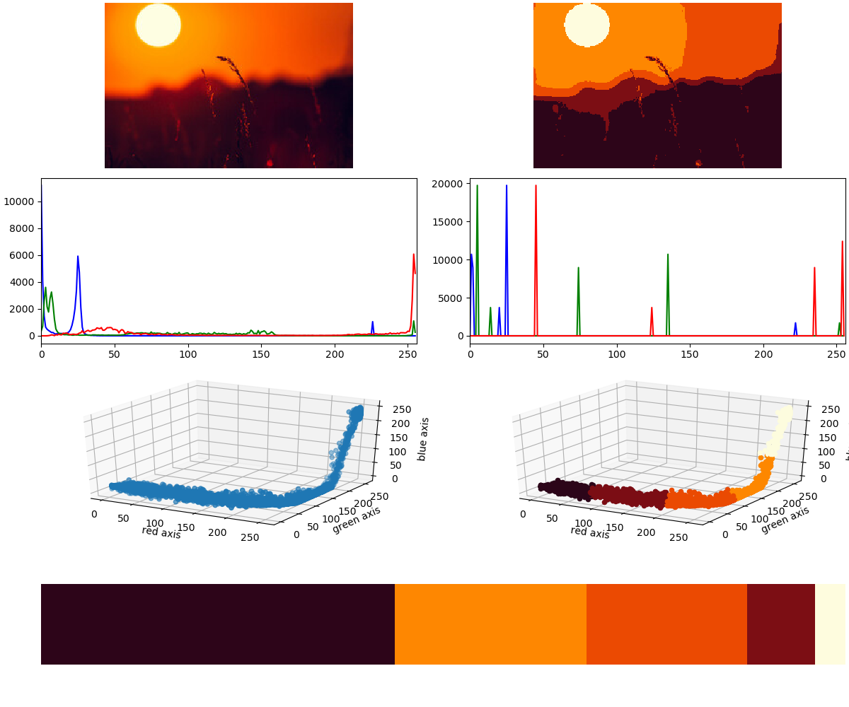
These charts show all the useful information in this regard. Here we have the source and quantized image, the respective histograms, the image in 3D color space and the color ratios. I have chosen (by gut feeling) to extract 5 clusters to get a somewhat meaningful ratios of colors.
Implementation
One could implement the K-Means-clustering algorithm themselves, as the naïve implementation is not that difficult. But as the problem is generally NP-hard, this implementation will be far from performant. But luckily, as eluded before this is a very common algorithm with many libraries for all kinds of different programming languages.
I’ve chosen python to implement this, for it’s “ease” of setup and programming. This most certainly hurt performance, but oh well. The following code snippets are hugely inspired by the article “Dominant colors in an image using k-means clustering” on buZZrobot.
The code just for the K-Means part looks like this
# OpenCV to work with the image data
import cv2
# the library for KMeans
from sklearn.cluster import KMeans
# numpy to do stuff with the data
import numpy as np

import sys

# read the image as first console argument
img = cv2.imread(sys.argv[1])
#convert from BGR to RGB
img = cv2.cvtColor(img, cv2.COLOR_BGR2RGB)
# converting the image to a single row of pixels, discarding positional information
img = img.reshape((img.shape[0] * img.shape[1], 3))

kmeans = KMeans(n_clusters = 5)
kmeans.fit(img)

print(kmeans.cluster_centers_)
print(kmeans.labels_)
That’s it. kmeans.cluster_centers_ contains the cluster centers a.k.a. as our 5 main colors. And kmeans.labels_ index of the cluster center for each sample
[[ 44.68424532   5.16334418  25.08543531]
 [253.91961596 135.52927334   0.91481551]
 [253.51028807 252.04820694 222.1734274 ]
 [234.99668105  74.60216838   2.21374046]
 [122.93569727  13.42974332  20.39587192]]

[3 3 1 ... 0 0 0]
If now want to calculate the ratios, we could do it like this, creating a histogram in bar-form:
CLUSTERS = 5

numLabels = np.arange(0, CLUSTERS + 1)
(hist, _) = np.histogram(lables, bins=numLabels)
hist = hist.astype("float")
hist /= hist.sum()
colors2 = colors
colors2 = colors2[(-hist).argsort()]
hist = hist[(-hist).argsort()]
chart = np.zeros((50, 500, 3), np.uint8)
start = 0

for i in range(CLUSTERS):
    end = start + hist[i] * 500
    # getting rgb values
    r = colors2[i][0]
    g = colors2[i][1]
    b = colors2[i][2]
    # using cv2.rectangle to plot colors
    print("cv2.rectangle()")
    cv2.rectangle(chart, (int(start), 0), (int(end), 50), (r, g, b), -1)
    start = end
Wrapping up
If you now want to see all combined information in a chart, the code would look like This
import matplotlib as mat
mat.use('GTK3Agg')
import matplotlib.pyplot as plt
from mpl_toolkits.mplot3d import Axes3D
import cv2
from sklearn.cluster import KMeans
import numpy as np
import sys

def rgb_to_hex(rgb):
    return '#%02x%02x%02x' % (int(rgb[0]), int(rgb[1]), int(rgb[2]))

CLUSTERS = 5

print("cv2.imgread()")
#read image
img = cv2.imread(sys.argv[1])


print("plt.figure()")
#plotting
fig = plt.figure(constrained_layout=True, figsize=(12, 10))
gs = fig.add_gridspec(4, 2)
ax1 = fig.add_subplot(gs[2, 0], projection='3d') # uncolored diagram
ax2 = fig.add_subplot(gs[2, 1], projection='3d') # colored diagram
ax3 = fig.add_subplot(gs[3, :]) # colors

ax4 = fig.add_subplot(gs[0, 0]) # source image
ax7 = fig.add_subplot(gs[0, 1]) # quantised image

ax5 = fig.add_subplot(gs[1, 0]) # source histogram
ax6 = fig.add_subplot(gs[1, 1]) # quantised histogram


# original historgram
clr = ('b','g','r')
for i, col in enumerate(clr):
    histr = cv2.calcHist([img], [i], None, [256], [0, 256])
    ax5.plot(histr, color=col)
    ax5.set_xlim(0, 256)

#convert from BGR to RGB
img = cv2.cvtColor(img, cv2.COLOR_BGR2RGB)

#get rgb values from image to 1D array
r, g, b = cv2.split(img)
r = r.flatten()
g = g.flatten()
b = b.flatten()

#uncolored 3d chart
print("ax1.scatter(r, g, b)")
ax1.scatter(r, g, b)

ax1.set_xlabel('red axis')
ax1.set_ylabel('green axis')
ax1.set_zlabel('blue axis')

# converting the image to a single row of pixels, discarding positional information
print("img.reshape()")
img2 = img.reshape((img.shape[0] * img.shape[1], 3))

# quantizing the colors
print("KMeans()")
kmeans = KMeans(n_clusters = CLUSTERS)
kmeans.fit(img2)
colors = kmeans.cluster_centers_
lables = kmeans.labels_

print(colors)
print(lables)

# create the colored chart and quantised images
# this takes a while
print("ax2.scatter()")
img_q = []
for label, pix in zip(lables, img2):
    img_q.append(np.rint(colors[label]).astype('uint8'))
    ax2.scatter(pix[0], pix[1], pix[2], color=rgb_to_hex(colors[label]))

img_q = np.array(img_q).reshape(img.shape)
img_q = cv2.cvtColor(img_q, cv2.COLOR_BGR2RGB)

cv2.imwrite("img.jpg", img_q)

# creating the quantised histogram
for i, col in enumerate(clr):
    histr = cv2.calcHist([img_q], [i], None, [256], [0, 256])
    ax6.plot(histr, color=col)
    ax6.set_xlim(0, 256)

ax2.set_xlabel('red axis')
ax2.set_ylabel('green axis')
ax2.set_zlabel('blue axis')

# calculating the ratios
numLabels = np.arange(0, CLUSTERS + 1)
(hist, _) = np.histogram(lables, bins=numLabels)
hist = hist.astype("float")
hist /= hist.sum()
colors2 = colors
colors2 = colors2[(-hist).argsort()]
hist = hist[(-hist).argsort()]
chart = np.zeros((50, 500, 3), np.uint8)
start = 0

for i in range(CLUSTERS):
    end = start + hist[i] * 500
    # getting rgb values
    r = colors2[i][0]
    g = colors2[i][1]
    b = colors2[i][2]
    # using cv2.rectangle to plot colors
    print("cv2.rectangle()")
    cv2.rectangle(chart, (int(start), 0), (int(end), 50), (r, g, b), -1)
    start = end

# display chart
ax3.axis("off")
print("ax3.imshow(chart)")
ax3.imshow(chart)

ax4.axis("off")
print("ax4.imshow(img)")
ax4.imshow(img)

ax7.axis("off")
print("ax7.imshow(img_q)")
img_q = cv2.cvtColor(img_q, cv2.COLOR_BGR2RGB)
ax7.imshow(img_q)

print("plt.show()")
#plt.show()
plt.savefig("fig.png")